About Company
Super Saver Foods was an American price-impact grocery franchise that provides groceries to your local community in Washington.
My Role
UX Designer (Solo Project)
Timeline
2 Weeks, 2022
The goal of this concept project is to re-designing the desktop checkout process not to sell more but to offer a pleasant experience for customers who care most about the cost. An improved website, including e-commerce, helps Saars Super Saver Foods showcase its products while maintaining its brand image: “small shop” appeal and great customer service.
Design Challenge
The user needs a way to compare and properly apply discounts so she can save money.
My Solution
Create a Hi-fidelity prototype that features a product page of price comparison and apply the coupons during the checkout process.
Able to filter and sort the products by clearance, sales, and weekly ads that will list the tons of products that are cheaper than usual.


Easily apply the coupon by clicking the product in your Cart!
You don't have to find the coupons in separate tabs or have to come back for coupons when you are ready to purchase your order.


See all lists of related products that are on sale!
You can see how much of the sale is on each product.
Define
Cost Is Most Important to Sophia
For this concept project, my target audience was given to me which is a deal diver.
I created a persona named Sophia who is a full-time college student and gets her allowances from her parents. What matters most to Sophia is the cost.

How Does Sophia Feels About Current Website?
She was frustrated and felt disappointed that she ended up leaving the website without purchasing anything. The biggest issues were to Sophia was that she wasn't sure how much of sale items were on sale and can't apply the coupons online.

How Can I Help Sophia to Save Money?
Now I know her frustrations with Sophia, how can I help Sophia to have a better shopping experience and save her money to find the lowest salad dressing? To help Sophia, I asked these questions...
How might we apply the coupons to the check out process easily?
Able to see the all lists of coupons in the checkout process or the website automatically generate the coupons that she saved can be applied at checkout.
How might we help Sophia to find the lowest prices?
Show all the related products that are on sale and indicate how much of a percentage of the sale is applied to each item with discounted price.
Sophia needs a way to compare and properly apply discounts so she can save money.
Design
Add Hint of Yellow to Bring Happiness
I compared lots of grocery stores and the majority of grocery stores use green as the dominant color since green is most prominently found in nature that symbolizes freshness, healthy plants, and produces. I wanted to differentiate from other grocery stores so I choose yellow to bring positivity and grab the attention at the same time.
I use yellow and dark green colors to point colors such as website navigations and buttons to click and use the charcoal color that is similar to black for most of fonts.

Redesigned the Logo
The current logo doesn't have the entire title of the store name and used red and black colors which somehow reminds me of the auto shop.
I thought this logo will not match what I come up with as a re-designed website so I went very simple and straight point into the logo. I used dark green as the background and use light beige color to stand out in the brand name.

Sketches to Wireframes
I digitized my initial designs into mid-fidelity wireframes to illustrate the steps Sophia would take to add products to her cart and apply the coupons easily while she is checkout.
Able to filter out the products by savings, clearance, on sales, weekly ad

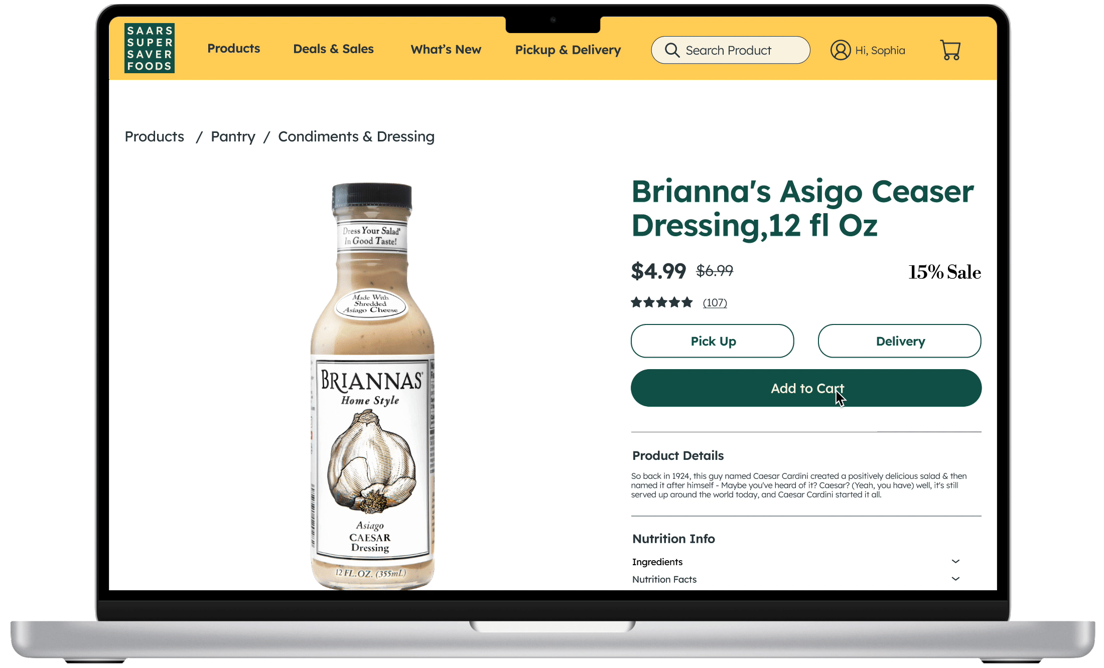
Shows the pictures of the product and detailed information including the nutrition information. It also indicates how much of the sale is on the product.


The coupon section is underneath the "My cart" that can easily look through the coupons to apply for certain products.

Under the product detail page, it shows similar products to compare to see better deals.
Result of Usability Test
I did a usability test of a total of five and get these results.
The average time to complete the goal is 51 seconds and the average number of clicks is 21.
I also scored on the Likert scale which an average is 4.6 out of 5.
One of the users said, "it's easy to follow and very clear what to click" and a few said the same thing which was mentioned that process of adding to the cart and checking out was very smooth.

Final Product!
I Learned...
It was my first e-commerce project at General Assembly and it was a great learning experience to implement what I learned as UX/UI skills. Although it was my first concept project, I am very grateful to learn the new skills and research methods and I felt I still have a long way to go and learn as a UX designer.
I would work on the coupon section little better such as implemented as search functions to quickly find the coupons instead of looking all the lists and love to create a mobile application where users are able to see the hot deals and save them into their account, and easy checkout that all the info is already filled in.